Item highlight, arrows or contextual controls make “hardcore” gamers rage but developing my game I learned they’re not always about dumbing, but accessibility.
Accessibility, not dumbing
I recently held a playtest of my upcoming adventure indie game Postmortem, where you play an agent Death who must pick one person to kill from a small cast of detailed characters in a complex setting of domestic conflict and industrial revolution. One tester, after talking to everyone and exploring for an hour, came to the point of choosing and literally sat for 10 minutes staring at the screen. Was she having an internal dialogue? Contemplating morality of her decisions like I hoped?
Nope.

She forgot who’s who, and what each person believed in. She was overwhelmed. She was a great artist with a talent for technology and design, but in turn simply did not have a talent for quick memorization of facts. Should she enjoy my game less because of that?
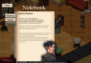
Hence, we introduced in-game notebook for tracking “quickfacts” and “clues” something I initially resisted for various design reasons. A focus-test induced “dumbing down” that proved necessary. That’s when I realized, those features are not always about dumbing down, but accessibility.
Different skillsets of different players
An exaggerated example, but try to think of it more like wheelchair-accessible ramps in a theater, or subtitles in a movie – not a core part of the artwork itself, but merely a way to experience it more easily. Yes it’s bad when those features get in the way of the game but that need not always be the case, and Valve, for instance, excels at integrating the “dumbing down” into the game world and narrative so well you don’t even notice it.

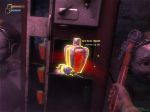
One popularly hated element is the dreaded “item hilight” in games like Bioshock or Deus Ex: Human Revolution (not counting loot-glint in Neverwinter Nights, Torchlight or Diablo). I’ll admit… I always liked that feature.
See, while I love the story, narrative, and shooting in those games, I am oft not too keen on obscure “key hunts,” especially in modern, rich and highly-detailed environments – sometime’s it’s impossible to tell which of the beautifully hi-poly objects are “interactable” , and running around madly tapping “use” on 500 identical cupboards isn’t playing. It’s tediousness and repetition defined.
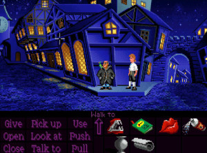
Another good example is the “contextual controls” which streamline numerous actions into a single button. How terrible, many gamers cried! It’s all for the stupid console kiddies with limited pads, they raged. Is it, though?

It reminds me of a recent adventure game I played and got stuck for a good hour until finally looking up a walkthrough. What was the solution?
Push a random tree in the background
…really? Why not pull? Or kick? Or Use? Why do we even need all those many actions, in 99% of the cases you can only interact with an item in one way, which is even more true in non-adventure games.
In Gears of War, you see cover, you get behind cover. There is no need for an extra “cover” button, as there’s only one way to use the “cover” object. Adding more buttons does not help the design or gameflow in any way, it creates the unnecessary need to manage yet another button, further alienating players who might not be as ambidextrous as you.
Failure of Design?

One might say that if a dumbing down occurs, it is a sign of failed design. If there wasn’t too much information in my game people could remember it easily; if interactable items were distinct they would not require hilights; if puzzles were logical, having multiple actions wouldn’t be a problem.
Another lesson I learned from my game is that, sadly, sometimes there simply isn’t time left to “improve the design” and fix the core problems. So what do you do when things aren’t clear but you don’t have time left to fix them? Annoying tooltip popups, immersion-breaking item hilights, simplistic objective arrow, boring notebooks… it’s not always the best solution, but it’s better than no solution at all.
But sometimes it just is dumb
I’m not excusing dumbing down as a stupid, modern trend, it definitely does exist. An example I often hear is Deus Ex Invisible Wars with it’s myriad of problems like universal ammo (among other examples). While it didn’t bother me personally, I can understand how it might undermine the “scarcity of resources,” a fundamental concept of the genre it was supposed to stand for. And I am all for giving the option to enable/disable little “helpers” like highlights or arrows.
But that’s also my whole point – if “dumbing down” does not detract from the design and experience, is it really dumbing down? It may not improve things for you, BUT it might improve them for those who don’t have as good memorizing skills as you, can’t pick up on subtle background details as well as you, or simply… don’t have the time or patience to be tediously running around in circles trying to find a solution or objective.
Sometimes people with slightly different skillsets but similar gaming-taste want to have as much fun as you. Is that so wrong?
The examples you gave aren’t “dumbing down”, they’re just plain good design.
Dumbing down is when the developer makes adjustments to the game because the player is too lazy to actually play. An example would be reading or having a dialogue about a quest in Oblivion then finding the quest objective on your own, versus sticking in a compass that tells you exactly where to go every time, which is what Bethesda decided to do in that game (and most of their games henceforth), to the detriment of game play enjoyment.
So, using your example of the notebook: if you had filled it with things she did not read during game play that would be “dumbing down”. But if it’s just an automatic, handy copy of the things she discussed with in-game characters, but in point form, that’s quite helpful.
John,
Thanks for the response, and that is part of my point – “dumbing down” is often confused with “accessibility” or “design.”
I would disagree with your example though – Morrowind’s journal quickly grew to be a mess of a wiki novel that made it impossible to find the info you actually needed without spending half an hour re-reading tens of pages and hopelessly clicking on key terms. Skyrim’s on the other hand, actually helped keep things organized. I’d admit it was too sparse and could have really used more “background” detail, but the base format was much better for this type of a game, and you could toggle quest markers off. But to me, with so many quests and huge worlds, having a clean breakdown of what to do and where to go was very welcome, especially when going back to the game after a bit of a break.
As for Postmortem, you’ll be happy to know our journal is pretty succinct, filling only with those clues you actually uncovered in-game :)
To me it is only dumbing down if to take out an element of challenge that had its own rules and was part of the gaming experience.
Streamlining things is just good design as Apple has shown.
Dumbing down isn’t necessary a bad thing in itself. As an example compare the old simulation games where you had to remember a number of buttons and knobs compared to games today where all that complexity is cut. However that complexity was part of the game even if there is no market for ti today.
I remember in Morrowind no knowing exactly where the quest is but it still had a flavor finding stuff. That was simply bad design, if they decided to keep it need better tools to give to the player for that. The point is not that they cut it, the point is there was a problem in the first place that to be better designed. You CAN add that complexity, its all in the design.
This was a really interesting read and I agree wholeheartedly. I wonder how you feel about mechanics that could be construed as “dumbing down” but are able to be deactivated? For instance, Skyrim allows you to turn off most of its hints, like quest markers, for a less guided experience. I assume that the journal in Postmortem can be used freely, while players who don’t want that bit of help can simply ignore it entirely.
This seems like the best of both worlds–including these mechanics but making them optional–yet I know the “hardcore” crowd sometimes still cries foul at their mere inclusion. Like the fact that the game -could- be made simpler at the push of a button somehow detracts from its actual challenge or fulfillment. Yet the games of old we reference as paradigms of challenge featured cheat codes, right? There have always been ways to make games more accessible to the wide range of players in the world. They’re just more visible in modern titles and, as you state above, included in the actual design of the game in the best-implemented cases.
Thanks for the comment and funny you mention that, because that’s exactly what we did in Postmortem – the journal can be actually disabled in the settings menu :) Character names too, by the way. We deliberately called both the “Complexity Settings” and not difficulty as not to discourage/encourage either option.
Personally I love those customization that allow people to tailor the game to their playstyle. Have you ever played System Shock 1? It actually had separate sliders in 4 categories (Combat, Puzzle, Cyber and Mission/Story) – http://koobazaur.com/blog/wp-content/uploads/2013/09/system-shock-1-difficulty-settings.jpg
HOWEVER I also understand developer’s hesitation to put those in – some, even seemingly tiny changes, can throw the balance off or significantly alter the experience. While I’m all for players customizing gameplay, it shouldn’t take away from the developer’s vision (too much!)